
Image Resizer Online — Exact Pixel Dimensions for Every Platform (2026)
You upload an image to Instagram. It crops wrong. You fix it for Facebook and it looks squished on mobile. You resize for LinkedIn and it comes out blurry. Each attempt creates a new version of the problem — and none of them quite right. This happens to almost everyone who creates content across multiple platforms, and it almost always comes down to the same misunderstanding: treating pixel dimensions as the primary concern when aspect ratio is actually what determines how an image displays.
This guide covers both — the correct dimensions for every major platform in 2026, and the reasoning behind them, so you're not just copying numbers but understanding why a 4:5 portrait performs better than a square on Instagram, or why uploading an image that's "already the right size" still comes out blurry.
The Thing Most Guides Get Wrong: Ratio First, Pixels Second
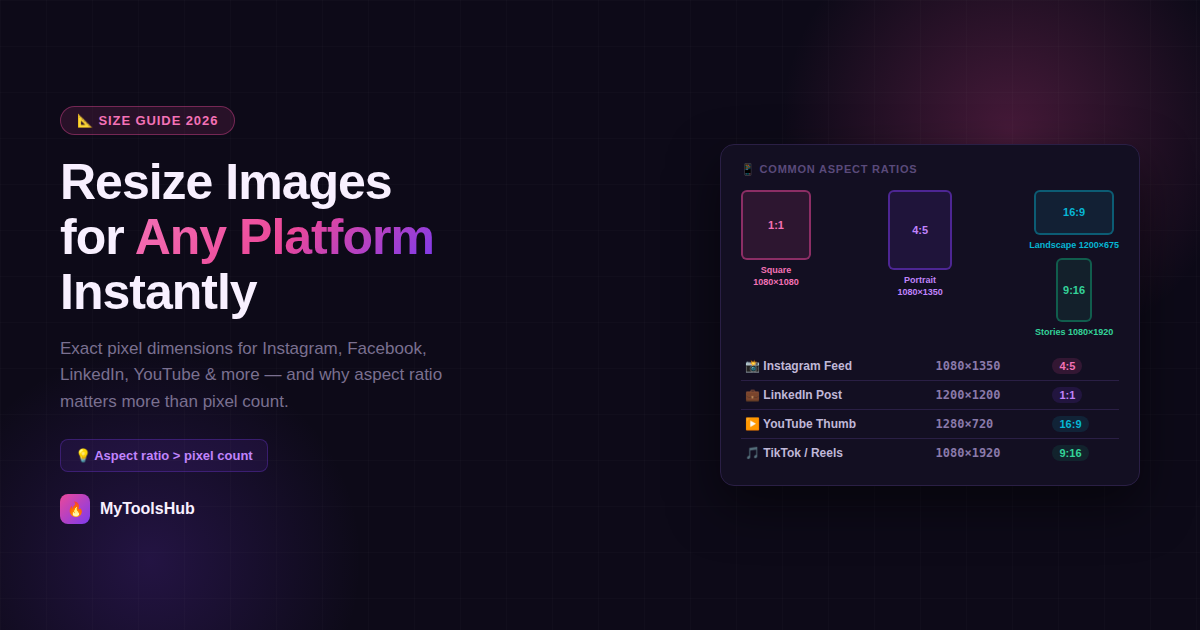
Platforms care about aspect ratio, not specific pixel counts. Instagram doesn't require exactly 1080×1350px — it requires a 4:5 ratio at sufficient resolution. The platform downscales an oversized image; it won't upscale an undersized one.
This is the single most important concept for understanding image sizing across platforms. If you upload a 2160×2700px image (also 4:5 ratio), Instagram will downscale it to 1080×1350 and display it correctly. If you upload a 500×625px image (also 4:5 ratio), it won't upscale it — instead, it will display the image at lower quality or reject it for insufficient resolution.
The practical implication: always start your workflow from the largest, highest-quality version of an image available. Resize down to the target dimensions — never up. Upscaling an image (making it larger than its original resolution) always introduces blur, because the resizing algorithm has to invent pixel data that wasn't there, and no algorithm does this without visible quality loss.
Why Your Uploaded Images Look Blurry Even at the Right Size
Getting the dimensions right is necessary but not sufficient for sharp-looking images on social platforms. There's a second compression pass that trips up many people:
Compression eats quality twice: every upload is re-encoded server-side. Export at 2× target dimensions with sRGB color profile and high quality to survive the second compression pass without visible banding or softness.
Every platform recompresses your upload — Instagram, Facebook, LinkedIn, X — all of them. They do this to control storage and delivery costs. If your image is already heavily compressed before you upload it, the platform's compressor is working with degraded data and the result looks noticeably worse. The fix is straightforward: export at high quality (JPEG at quality 85 or above, or PNG for graphics with text) and let the platform's compression be the only compression pass, not the second one.
Three other common causes of blur after uploading:
- Wrong color profile: Always export in sRGB. Adobe RGB and Display P3 images often display with washed-out or oversaturated colors after platform conversion. If you've edited in a wide-gamut color space, convert to sRGB before exporting.
- File size too large, triggering heavy recompression: Most platforms have upload limits (Facebook: 30MB, LinkedIn: 8MB, X: 5MB). Exceeding these triggers aggressive server-side compression. Stay under the limit with a high-quality export, not by pre-compressing heavily.
- Source image smaller than display size: If the original is 600px wide and you're uploading to a platform that displays at 1080px, you've already lost — the platform will upscale and blur is unavoidable. Use a larger source.
The 2026 Platform Size Reference — Every Major Platform
| Placement | Dimensions | Ratio | Note |
|---|---|---|---|
| Feed (portrait — recommended) | 1080 × 1350px | 4:5 | Occupies most screen space; best for engagement |
| Feed (square) | 1080 × 1080px | 1:1 | Works everywhere; smaller feed footprint than portrait |
| Feed (landscape) | 1080 × 566px | 1.91:1 | Underperforms in organic feed; use for repurposing |
| Stories / Reels | 1080 × 1920px | 9:16 | Safe zone: avoid top 250px and bottom 350px for text |
| Profile photo | 320 × 320px min | 1:1 | Displayed as circle; upload larger for retina screens |
| Placement | Dimensions | Ratio | Note |
|---|---|---|---|
| Feed / shared image | 1200 × 630px | 1.91:1 | Standard for link previews and shared posts |
| Feed ad | 1440 × 1440px | 1:1 | Or 1440 × 1800px for 4:5 |
| Cover photo | 820 × 312px | ~2.63:1 | Mobile crops to center; keep text away from edges |
| Stories | 1080 × 1920px | 9:16 | Cross-posts from Instagram Stories at same spec |
| Profile photo | 196 × 196px | 1:1 | Displays at 176px desktop, 196px mobile |
| Placement | Dimensions | Ratio | Note |
|---|---|---|---|
| Feed post (square) | 1200 × 1200px | 1:1 | Best performing format for organic reach |
| Feed post (landscape) | 1200 × 627px | 1.91:1 | For link previews and repurposed content |
| Personal profile banner | 1584 × 396px | 4:1 | Mobile shows center crop ~1000px wide; keep text centered |
| Company page cover | 1128 × 191px | ~6:1 | Extremely wide; keep logo and text in center 50% |
| Profile photo | 400 × 400px min | 1:1 | PNG recommended for logos; JPEG for photos |
| Placement | Dimensions | Ratio | Note |
|---|---|---|---|
| In-stream post image | 1200 × 675px | 16:9 | No cropping on desktop or mobile at this ratio |
| Profile header | 1500 × 500px | 3:1 | Profile photo overlaps lower-left; keep key content right-center |
| Profile photo | 400 × 400px | 1:1 | Displayed as circle; center your subject |
| Link preview card | 1200 × 630px | 1.91:1 | Pulled from Open Graph metadata of linked page |
| Placement | Dimensions | Ratio | Note |
|---|---|---|---|
| Video thumbnail | 1280 × 720px | 16:9 | Under 2MB; JPG, GIF, or PNG |
| Channel banner | 2560 × 1440px | 16:9 | Safe zone: central 1546 × 423px visible on all devices |
| Channel profile photo | 800 × 800px | 1:1 | Displayed as circle; upload at 800px minimum |
| Platform | Dimensions | Ratio | Note |
|---|---|---|---|
| TikTok video/photo | 1080 × 1920px | 9:16 | UI overlays right 250px and bottom 300px — keep content clear of these |
| TikTok profile photo | 200 × 200px min | 1:1 | Displayed as circle |
| Pinterest Pin (standard) | 1000 × 1500px | 2:3 | Tall format dominates feed; 2:3 is the most shared ratio |
| Pinterest Profile photo | 165 × 165px | 1:1 | Upload at 800px+ for retina sharpness; Pinterest resizes |
The Safe Zone Concept — What Gets Cropped on Mobile
A safe zone is the central area of an image that remains visible regardless of how the platform crops it across different screen sizes and devices. Ignoring safe zones is the most common reason text, logos, and key subjects appear cut off — especially on mobile where platform UI (navigation bars, action buttons, captions) overlaps the image edges.
The safe zones that matter most in practice:
- Instagram Stories and Reels (1080×1920): The top 250px and bottom 350px are overlaid by platform UI. Keep critical content — text, faces, CTAs — within the central 1080×1320px area.
- Facebook cover photo (820×312): The photo displays differently on desktop (full width) and mobile (center-cropped). Keep all important content within the central 640px of the width.
- LinkedIn personal banner (1584×396): On mobile, LinkedIn shows a center crop of approximately 1000px wide. Keep all text, logos, and faces within the center 1000px column — anything near the left or right edges is cropped on mobile.
- YouTube channel banner (2560×1440): Only the central 1546×423px is guaranteed visible across TV, desktop, and mobile. The outer bands are cropped on smaller displays.
- X profile header (1500×500): The profile photo overlaps the lower-left corner. Important design elements should sit right-of-center and away from the bottom-left quadrant.
Quick Reference: Universal Sizes That Work Everywhere
If you're creating content for multiple platforms and need a single starting point:
Best for mobile-first platforms: 1080×1350px (4:5 portrait) — takes up the most screen space on Instagram and Facebook feeds.
Best for Stories, Reels, TikTok, Shorts: 1080×1920px (9:16 vertical) — the universal standard for full-screen vertical formats.
Best for link previews across all platforms: 1200×630px (1.91:1) — the Open Graph standard used by Facebook, LinkedIn, X, and most messaging apps.
When Resizing Actually Hurts Your Image — Cases to Avoid
Not every image should be resized, and understanding when not to resize saves you from quality problems that resizing causes rather than solves.
- Never upscale: If your image is 800×600px and you resize it to 1600×1200px, you haven't added resolution — you've added blur. The resizing algorithm interpolates (guesses) the new pixels, and the result looks soft at 100% zoom. This is the most common resizing mistake.
- Don't resize multiple times: Each resize-save cycle on a JPEG introduces additional compression artifacts. If you need an image at three different sizes, resize from the original each time, not from the previously resized version.
- Don't resize a screenshot to "improve" it: Screenshots are pixel-perfect at their native resolution. Resizing a screenshot larger than its original dimensions makes text and UI elements look fuzzy. Screenshots should be used at native size or smaller.
- Avoid JPEG for images with sharp text or flat color areas: JPEG compression introduces ringing artifacts around high-contrast edges (text, logos, icons). For these, PNG preserves quality at resized dimensions without compression artifacts.
The Right Workflow for Resizing Images
- Start from your largest source file — original photo from your camera, raw export from your design tool, or the highest-resolution version available. This is the master file; don't delete it.
- Determine the target aspect ratio first — not the pixel dimensions. Know whether you're creating a square, a 4:5 portrait, or a 16:9 landscape. This determines how much of the image will be visible.
- Crop to the aspect ratio before resizing to pixel dimensions. If you resize first and then crop, you may be throwing away resolution you needed.
- Resize to the target dimensions — equal to or slightly larger than the canonical platform dimensions. Never smaller.
- Export at high quality — JPEG at 85–90 quality for photographs, PNG for graphics with text or transparency. This is the file you upload.
- Check the safe zones before posting — zoom into a mobile preview and confirm that text, logos, and subjects aren't sitting in areas that get cropped or overlaid by platform UI.
What Changes in 2026 Versus Previous Years
Platform image specs are relatively stable year to year, but a few significant shifts in 2026 are worth knowing:
- Instagram is officially 4:5 first: Meta officially prioritises 4:5 portrait feed posts over 1:1 squares in 2026. Squares still render, but portraits occupy more screen real estate and lift reach measurably.
- WebP is now widely accepted: WebP is now accepted on most major platforms as of 2026, but JPEG remains the safest universal fallback. PNG-24 is still required for transparent logos on profile photos and LinkedIn banners.
- AI-generated images require disclosure on major platforms: Meta, TikTok, and YouTube all require disclosure of AI-generated or materially altered content in 2026. Metadata flags (C2PA credentials) trigger automatic labels on Instagram and Facebook. This doesn't affect resizing per se, but affects how AI-generated images are handled after upload.
- Japan lowered its adult age to 18 (unrelated, but the equivalent platform shift): LinkedIn now has distinct requirements for personal profiles versus company pages, and personal profile banners behave differently on mobile than they did in previous years — the mobile crop has narrowed to approximately 1000px centered.
Image Sizes Beyond Social Media — Ecommerce and Blogs
Social media gets most of the attention in image sizing guides, but ecommerce product images and blog featured images have their own requirements that are just as important for performance and appearance.
Ecommerce Product Images
Product image quality is one of the highest-impact factors on ecommerce conversion rates — and most platforms have both minimum requirements and recommended best practices:
| Platform | Minimum Size | Recommended | Key Requirement |
|---|---|---|---|
| Amazon | 500 × 500px | 2000 × 2000px | White background (#FFFFFF) for main image; zoom requires 1000px+ on longest side |
| Shopify | No minimum | 2048 × 2048px | Square images (1:1) recommended for consistent grid display |
| Etsy | 570 × 456px min | 2000px+ on longest side | Listing images display at 570×456; thumbnails at 170×135 |
| Flipkart | 500 × 500px min | 1000 × 1000px | White background required for main listing image |
| WooCommerce | Depends on theme | 800 × 800px minimum | Thumbnails auto-generated; set dimensions in theme settings |
The consistent thread across ecommerce platforms is that zoom functionality requires high resolution — Amazon's zoom activates at 1000px on the shortest side, which means a 500px minimum image gives you an accepted listing but no zoom, costing you an important conversion feature. Uploading at 2000px minimum covers all platforms and all features.
Blog and Website Featured Images
Featured images for blog posts serve two distinct purposes: the display within the blog itself, and the preview image when the post is shared on social media (via Open Graph metadata). These two contexts have different requirements:
- Display within the blog: Typically 1200px wide is sufficient for most themes. The exact height depends on your theme's aspect ratio — most modern blog themes use 16:9 (1200×675px) or 3:2 (1200×800px) for featured images.
- Social share preview: When your blog post URL is shared on Facebook, LinkedIn, X, or messaging apps, the platform pulls your Open Graph image. The universal safe size is 1200×630px (1.91:1) — this renders correctly as a link preview on all major platforms without cropping.
The practical solution: create your blog featured image at 1200×630px. It covers the social share use case precisely, and most blog themes will scale it correctly for the post display. If your theme uses a taller aspect ratio for the in-post display, you'll need a separate crop — but 1200×630px is the minimum to get right.
Format Choice After Resizing — JPEG, PNG, or WebP
The file format you export to after resizing affects both quality and file size, and the right choice depends on what the image contains:
- JPEG: Best for photographs. Uses lossy compression that's very efficient on continuous-tone images (photos, gradients). At quality 85, file sizes are small and quality is indistinguishable from lossless. Not suitable for images with sharp text, flat colors, or transparency.
- PNG: Best for graphics, logos, screenshots, and anything with text. Lossless compression preserves hard edges and flat colors without artifacts. File sizes are larger than JPEG for photographs, but smaller for flat-color graphics. The only format that supports full transparency (alpha channel).
- WebP: WebP is now accepted on most major platforms as of 2026. It produces smaller file sizes than JPEG at equivalent quality for photographs, and smaller than PNG for graphics. Use it when file size is critical and you've confirmed the receiving platform supports it. JPEG remains the safest universal fallback.
Photo → JPEG at quality 85
Logo / text / graphic → PNG
Web delivery where size matters → WebP (if supported)
Transparent background → PNG (JPEG cannot store transparency)
Frequently Asked Questions
What is the best image size for social media in 2026?
The best universal size for cross-platform posting is 1080×1080px (1:1 square). For maximum feed space on mobile-first platforms, 1080×1350px (4:5 portrait) is the recommended Instagram and Facebook format. For Stories, Reels, TikTok, and YouTube Shorts, 1080×1920px (9:16) is the standard.
Why does my image look blurry after resizing?
Usually one of three causes: the source image was smaller than the target dimensions (upscaling always degrades quality), the image was compressed before uploading and the platform's recompression worsened it, or it was uploaded in the wrong aspect ratio and the platform cropped and re-rendered it. Always resize from the largest available source, export at high quality, and use sRGB color profile.
What is a safe zone?
The central area guaranteed to remain visible regardless of how a platform crops the image across devices. On Instagram Stories (1080×1920px), the top 250px and bottom 350px are covered by platform UI — keep text and important subjects within the central 1080×1320px. Ignoring safe zones is the most common reason logos and text appear cut off on mobile.
Should I resize to the exact pixel dimensions or just the aspect ratio?
Aspect ratio is the critical factor. Platforms care about ratio, not specific pixel counts — they downscale but never upscale. Hit the ratio at the recommended pixel dimensions or larger. Uploading exactly at 1080px wide (or above) ensures the sharpest result; uploading below that resolution risks a blurry display.
Does image file size affect quality on social platforms?
Yes. Every platform recompresses uploads server-side. If your image is already heavily compressed, the platform's second compression produces visible banding and softness. Export at high quality and let the platform's compression be the only compression pass, not the second one.
After resizing, if your file is still too large for upload size limits, use our Image Compressor to reduce file size without visible quality loss — it's useful specifically for keeping files under platform upload limits while maintaining display sharpness.
Comments (0)
Leave a Comment